Author: jcorcione

  • Cómo arreglar el texto borroso del Samsung Galaxy S26 Ultra

    Cómo arreglar el texto borroso del Samsung Galaxy S26 Ultra

    Si tu búsqueda de solución para el texto borroso del Samsung Galaxy S26 Ultra te trajo aquí, empieza por el hardware de la pantalla en lugar de cambiar fuentes al azar o desinstalar aplicaciones. Las letras borrosas, los iconos dentados y la "rejilla de pantalla de mosquitera" visible pueden provenir de la capa de Pantalla de privacidad integrada en el teléfono. Samsung dice que su modo de privacidad máximo puede difuminar ligeramente la pantalla o alterar los colores, y la función utiliza control de píxeles integrado en el hardware para estrechar los ángulos de visión.

    Hay otra capa en el problema. El S26 Ultra utiliza un panel de 8 bits con procesamiento de color mDNIe de 10 bits, que se basa en el tramado de color temporal para simular una profundidad de color adicional. Ese comportamiento de color de fotograma a fotograma puede parecer un brillo o parpadeo para algunos usuarios, especialmente junto con la estructura de píxeles direccional utilizada por la Pantalla de privacidad. Es por eso que el problema puede seguir siendo notable incluso después de que la Pantalla de privacidad parezca estar desactivada. Los síntomas son reales para algunos propietarios, pero no afectan a todos los S26 Ultra.

    Si el texto borroso aparece junto con un consumo de batería inusual durante la noche, compara el comportamiento del teléfono con los pasos de solución de problemas de la guía de consumo de batería del Galaxy de Tooled Out. Eso ayuda a separar una queja de la pantalla de un problema de aplicación en segundo plano o térmico.

    • Solución rápida 1: Desactiva la Pantalla de privacidad y sus condiciones de activación automática.
    • Solución rápida 2: Cambia la resolución de pantalla de QHD+ a FHD+ y compara el texto pequeño a una distancia de visualización normal.
    • Solución rápida 3: Desactiva el Tono de color adaptable y el Filtro de luz azul, luego prueba la pantalla de nuevo a un nivel de brillo constante.
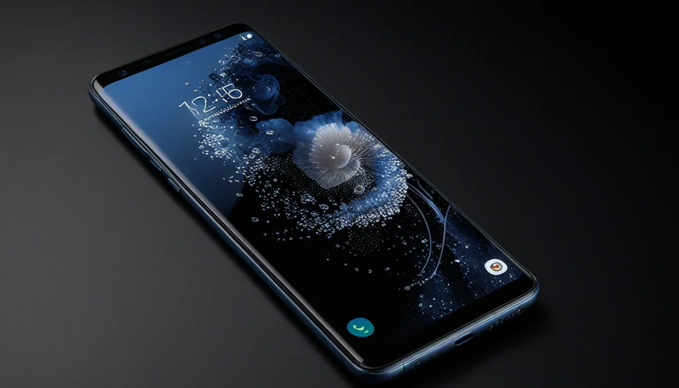
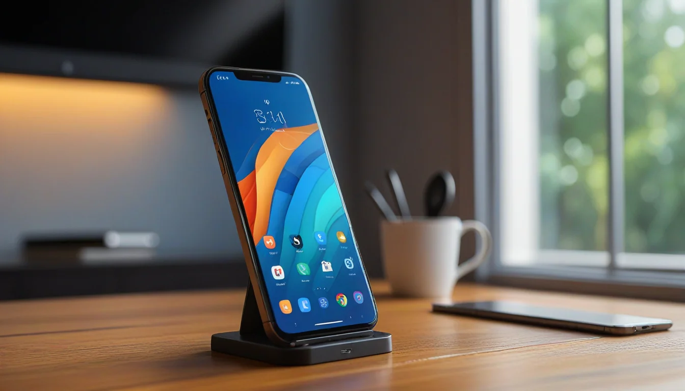
    Samsung Galaxy S26 Ultra: solución para pantalla con texto borroso que muestra una pantalla de smartphone realista
    Pantalla estilo Galaxy S26 Ultra que muestra el comportamiento de la pantalla discutido en esta guía.

    Por qué el texto del Galaxy S26 Ultra se ve borroso o pixelado

    El S26 Ultra no utiliza un protector de pantalla de privacidad normal. Su Pantalla de privacidad cambia la forma en que diferentes partes de la estructura de píxeles emiten luz, lo que hace que la pantalla sea más difícil de leer desde un ángulo. Ese diseño es útil para bloquear a los fisgones, pero también puede reducir la nitidez percibida y hacer que el texto fino se vea granulado.

    Con la protección de privacidad activa, las partes claras y oscuras de las letras pueden aparecer separadas por una rejilla tenue. Las fuentes finas y el texto brillante sobre fondos oscuros lo muestran con mayor claridad. El texto blanco, los iconos pequeños y los menús de alto contraste suelen ser mejores objetivos de diagnóstico que las fotografías o los vídeos.

    Samsung documenta los controles de Pantalla de privacidad en Ajustes > Pantalla > Pantalla de privacidad. La compañía también advierte que la protección de máxima privacidad puede atenuar la pantalla y difuminar o alterar ligeramente los colores. Consulta las instrucciones de Pantalla de privacidad del Galaxy S26 Ultra de Samsung antes de cambiar nada más.

    Reparación 1: Desactivar Pantalla de privacidad y activación automática

    Desactivar la función completamente

    1. Abre Ajustes.
    2. Toca Pantalla.
    3. Toca Pantalla de privacidad.
    4. Desactiva Activar Pantalla de privacidad.
    5. Desactiva Protección de máxima privacidad si sigue disponible.

    También puedes abrir el Panel rápido, mantener pulsado el icono de Pantalla de privacidad y desactivar la función desde allí. Después de hacerlo, abre una página con texto pequeño en negro sobre fondo blanco. Luego, comprueba texto blanco sobre fondo negro. Si ambos se ven más nítidos, la capa de píxeles de privacidad es la causa principal del efecto rejilla.

    Evitar que Pantalla de privacidad se reactive sola

    Si la falta de nitidez regresa después de abrir una aplicación bancaria, introducir tu PIN o recibir una notificación, es probable que una condición automática esté reactivando la función.

    1. Ve a Ajustes > Pantalla > Pantalla de privacidad.
    2. Toca Condiciones de activación.
    3. Desactiva la activación automática para aplicaciones, credenciales de pantalla de bloqueo y notificaciones emergentes.
    4. Prueba el mismo texto de nuevo sin cerrar la aplicación entre comprobaciones.

    La guía de solución de problemas de Samsung confirma que las condiciones automáticas pueden reactivar Pantalla de privacidad sin que el interruptor principal parezca estar permanentemente activado. Si la función sigue volviendo, revisa esas condiciones antes de culpar al panel.

    Reparación 2: Bajar la resolución de pantalla de QHD+ a FHD+

    Cambiar la resolución no reparará la disposición física de los píxeles. Es una prueba de enmascaramiento que cambia cómo One UI escala el texto, los iconos y los bordes de la interfaz. En algunos teléfonos, FHD+ hace que la cuadrícula visible sea menos molesta porque el detalle fino del borde se renderiza con un patrón de escalado menos agresivo.

    Cambiar el ajuste de resolución

    1. Abre Ajustes.
    2. Toca Pantalla.
    3. Toca Resolución de pantalla.
    4. Selecciona FHD+.
    5. Toca Aplicar.

    Dale al teléfono unos segundos para redibujar la interfaz. Luego compara los mismos elementos en ambas resoluciones:

    • Texto pequeño en los menús de Ajustes
    • Etiquetas de aplicaciones debajo de los iconos de la pantalla de inicio
    • Fuentes finas en Chrome o Samsung Internet
    • White text on a black background
    • Fine diagonal lines in icons and interface graphics

    If FHD+ makes the letters look calmer or less jagged, keep it for a day and see whether the tradeoff is acceptable. You may notice less detail in photographs and video. If the screen-door grid remains equally visible at both resolutions, resolution is not the root cause. For other Android display and device-setting checks, see Android tips and tricks that are worth setting up.

    Fix 3: Force Dark Mode to hide the visible grid

    Dark Mode cannot remove the physical privacy pixel structure. It reduces the amount of bright content that exposes it. That makes this a useful comfort and readability test, not a permanent hardware repair.

    1. Abre Ajustes.
    2. Toca Pantalla.
    3. Select Dark.
    4. Turn off any scheduled mode temporarily so the phone does not switch back while you test.

    Use Dark Mode with FHD+ for the first comparison. Check the same menus that looked fuzzy before. If icons and text look less harsh, the bright subpixel transitions were making the grid easier to see.

    If Dark Mode makes the dithering more noticeable, reverse the test. Some users see shimmer more easily around bright text on a dark background. The useful result is not which mode wins in theory. It is which mode produces the cleanest text on your own unit.

    Fix 4: Disable Adaptive color tone

    Adaptive color tone changes color and white balance based on ambient lighting. That can make the screen look warmer, cooler, dimmer, or unstable while you are trying to judge text sharpness. It does not change the pixel layout, but it can add another moving variable to the test.

    1. Abre Ajustes.
    2. Toca Pantalla.
    3. Turn off Adaptive color tone.
    4. Return to the same text and icon test.

    Samsung’s display troubleshooting guidance specifically recommends turning off Adaptive color tone when colors or white balance change unexpectedly. Keep it off while testing the fuzzy text problem so the display is not adjusting itself as room lighting changes.

    Fix 5: Disable Eye comfort shield and check Extra dim

    Eye comfort shield changes the screen’s color temperature, often making whites appear yellow or orange at scheduled times. That warmer tone can make a fuzzy edge look softer and can make a flickering artifact easier to notice.

    1. Open Settings > Display.
    2. Turn off Eye comfort shield.
    3. Open Settings > Accessibility > Vision enhancements.
    4. Turn off Extra dim while testing.
    5. Set brightness to a steady level instead of using Adaptive brightness for the comparison.

    Samsung notes that Eye comfort shield can change screen color and that Extra dim can make the display darker than expected. These settings may not cause the screen-door grid, but disabling them helps separate color and brightness changes from a physical sharpness problem.

    What 10-bit color dithering has to do with the S26 Ultra display

    The “10-bit” discussion needs precision. Reports and display testing describe the S26 Ultra as using an 8-bit panel with 10-bit mDNIe color processing. That means the phone can process more color information than the panel natively displays. Temporal dithering alternates nearby color values rapidly to create the appearance of smoother gradients.

    That process is not the same thing as a software setting that can simply be switched off. If you see shimmer, crawling edges, or a faint flicker after disabling Privacy Display, Adaptive color tone, Eye comfort shield, and Extra dim, the remaining effect may be tied to the panel, pixel layout, PWM behavior, or dithering implementation.

    Do not confuse a screenshot with what your eyes see. A screenshot captures rendered pixels before the panel’s physical light behavior occurs. A phone photograph may show moire or camera shutter artifacts. Judge the display directly, and use a second phone only as a reference. If you need to document the comparison, Tooled Out also has a guide to taking screenshots on Android.

    How to tell whether this is a setting or a defective display

    • If Privacy Display off makes the text immediately clearer, the privacy layer is involved.
    • If FHD+ changes the appearance but does not remove the grid, resolution is masking the symptom rather than fixing it.
    • If Adaptive color tone or Eye comfort shield changes the color but not the letter edges, those settings were secondary contributors.
    • If the same fuzziness remains at different brightness levels, resolutions, color modes, and with Privacy Display off, suspect a panel characteristic or hardware issue.
    • If the display causes headaches, nausea, eye pain, or persistent visual discomfort, stop testing and contact Samsung support or use the return or warranty process.

    Bottom line

    The most effective Samsung Galaxy S26 Ultra fuzzy text display fix is usually a combination of turning off Privacy Display automation, testing FHD+, using Dark Mode, and disabling Adaptive color tone and Eye comfort shield. Those steps can reduce the visible screen-door grid and remove some color or flicker artifacts.

    They cannot redesign the panel. If fuzzy text remains with Privacy Display fully disabled and the display still looks worse than a known-good phone at the same brightness, document the difference and treat it as a hardware or panel-behavior concern rather than continuing to chase settings.

    My hands-on context: I own a Galaxy S25 Ultra and have not run into this fuzzy-text or screen-door issue on it. A few friends with Galaxy S26 Ultra phones have asked me about similar display symptoms, which prompted me to research the issue and write this guide. I am documenting the reported behavior and troubleshooting steps here; I am not claiming that I personally reproduced the defect on an S26 Ultra.

    Technical references: Samsung Galaxy S26 Ultra Privacy Display guide, Samsung Privacy Display troubleshooting, Samsung display color settings guide, and Android Central’s Galaxy S26 Ultra display testing.

    Please support our other platforms it helps support the site, Thanks!
  • Galaxy S25 Ultra Battery Draining Fast? Here’s What Actually Fixes It (2026)

    Galaxy S25 Ultra Battery Draining Fast? Here’s What Actually Fixes It (2026)

    Galaxy S25 Ultra Battery Draining Fast? What Actually Fixes It (2026)

    Okay, is your Galaxy S25 Ultra battery draining Fast? More than it used to? Don’t start uninstalling apps at random. There’s a specific order that actually finds the problem instead of guessing at it, and most of the fix is settings you already have, not a new app or a warranty claim.

    This is the exact sequence I run on my own S25 Ultra whenever a battery day feels off — diagnose first, then fix the actual cause instead of every possible cause at once.

    Check this first: find the actual drain

    Before changing any settings, find out what’s actually eating the battery. Go to Settings > Battery and look at the usage graph and app list for the last 24 hours or 7 days. If one app is way out of proportion to how much you actually use it, that’s your problem — skip straight to fixing that app, not your whole phone.

    Also check battery health itself under Settings > Battery and device care > Diagnostics. A battery that’s aged down to 80-85% capacity will drain faster no matter what settings you change — that’s a hardware conversation, not a software one, and it’s worth knowing before you spend an hour tweaking toggles that won’t fix it.

    Fix the display settings that are actually draining you

    The 6.9-inch display is the single biggest power draw on this phone, full stop. Lower the brightness and turn on Adaptive brightness under Settings > Display so it’s not sitting at max in a bright room out of habit. Drop the screen timeout to 30 seconds while you’re in there — it’s a small thing that adds up over a full day of screen-on time.

    If you’re running the display at WQHD+, drop it to FHD+ in the resolution settings. The sharpness difference is not something you’ll notice in daily use, but it measurably helps battery life. Dark mode helps too, since this is an OLED panel — dark pixels are genuinely turned off, not just recolored.

    One most people skip: the performance profile. Under Settings > Battery and device care > Battery > More battery settings, switch from Standard to Light performance mode if you’re not gaming or editing video. The Snapdragon chip in this phone is built for sustained heavy loads — running it in Standard mode for basic texting and browsing is like idling a truck engine all day.

    Stop background apps from bleeding power

    Go to Settings > Apps, tap into any app, and check its Battery setting. Set the worst offenders to Restricted so they can’t run in the background at all. Be careful doing this to messaging apps — restricting WhatsApp or your default messaging app can delay notifications, which creates a different annoyance than the one you started with.

    Location services are the other quiet drain. Check Settings > Location for which apps have recent access, and change anything that doesn’t need constant location to “Allow only while using the app.” If you’re not actively using a Bluetooth accessory, turn Bluetooth off from the quick panel instead of leaving it scanning in the background.

    Update software and use Samsung’s built-in battery tools

    Check Settings > Software update and make sure you’re current — Samsung ships real battery optimizations in routine updates, not just security patches. Update your apps too, since a buggy app version is a common, boring cause of sudden drain that has nothing to do with your phone’s settings at all.

    In Settings > Battery and device care > Battery > Background usage limits, turn on both Put unused apps to sleep and Deep sleeping apps. Let the system manage anything you haven’t opened in weeks instead of manually hunting for every stale app yourself.

    Rule out a hardware or charging problem

    If the drain is sudden and severe rather than gradual, boot into Safe Mode (hold the power button, then press and hold the Power off icon until the Safe Mode prompt shows). If battery life is normal in Safe Mode, a downloaded app is the cause — you’ll need to uninstall recent installs one at a time to find it.

    Charging habits matter more than people think. The S25 Ultra supports 45W wired charging, but only with a genuine PPS-compatible charger — a mismatched charger just means more time plugged in generating heat, which isn’t good for the battery long-term. Wireless charging is convenient but runs less efficient and hotter than a wired connection, so it’s not the move if you’re actively fighting a drain problem.

    As a last resort, Settings > General management > Reset > Reset all settings clears out software glitches without touching your photos or files. You’ll need to reconnect Wi-Fi and reset your wallpaper afterward, but it’s a real fix for drain caused by a corrupted setting, not just a “have you tried turning it off and on again.”

    What I checked on my own S25 Ultra before writing this

    I run this exact phone daily. Before writing any of this up, I went through my own Battery usage graph, checked which apps were actually running background tasks I didn’t need, and tested the Light performance mode switch for a few days to see if it changed anything noticeable for regular use (it did — better battery, no real difference for texting, browsing, and normal camera use).

    Twenty years of managing IT projects made me distrust “just restart it” advice — the diagnose-first order above is the same logic I’d apply to any system throwing an unexplained resource problem: find what’s actually consuming the resource before you start changing settings that might not even be related.

    Galaxy S25 Ultra Battery Draining Fast? FAQs

    Is it normal for a new S25 Ultra to drain fast for the first few weeks?

    Somewhat, yes. Adaptive battery features learn your usage patterns over the first couple of weeks, and battery reporting can look inconsistent during that window. If drain is still bad after 2-3 weeks of normal use, it’s worth working through the diagnose-first steps above rather than assuming it’ll fix itself.

    Does Dark mode actually save meaningful battery on this phone?

    Yes, because the S25 Ultra has an OLED display. Dark pixels are genuinely powered off rather than just displayed as a dark color, so Dark mode saves real power on this screen specifically — it wouldn’t matter the same way on an LCD phone.

    When is battery drain actually a hardware problem, not a settings problem?

    Check battery health under Settings > Battery and device care > Diagnostics first. If capacity has dropped noticeably and drain is sudden rather than gradual, and Safe Mode doesn’t fix it, that points to hardware or a charging issue rather than something you can fix in settings.


    Related articles on Tooled Out:


    About the author: John Corcione has managed IT and telecom projects for 20 years, which means diagnosing what’s actually causing a problem before touching anything is second nature. Tooled Out is where he writes up what’s actually worth setting up. Say hi at dot.cards/gigawerx or linktr.ee/gigawerx.


  • Android Tips and Tricks: 5 Features Worth Setting Up Today (2026)

    Android Tips and Tricks: 5 Features Worth Setting Up Today (2026)

    Android Tips and Tricks: 5 Features Worth Setting Up Today (2026)

    I run Android because I like being able to actually change how the phone works, not just look at it. Twenty years of managing IT and telecom projects means I spend a lot of time in phone settings menus, and most of what gets written up as “hidden Android tips and tricks” is either buried three menus deep for no reason or doesn’t actually do anything useful once you turn it on.

    This page pulls together the Android features I’ve actually set up on my own Samsung Galaxy S25 Ultra and use regularly — not a scraped list of 50 settings nobody touches. Each one links to a full step-by-step guide. Start with whichever problem you actually have.

    Quick picks: Android tips and tricks worth setting up


    Feature What it fixes Setup time Guide
    Home screen widget shortcuts Sports, news, weather on your home screen without extra apps ~2 minutes Full guide
    Screenshot methods Every way to capture your screen, scrolling included N/A Full guide
    One-tap DND fix Restores the Pixel Quick Settings toggle that silently stopped working ~2 minutes Full guide
    Advanced Protection Google’s strongest anti-scam and anti-malware lockdown ~5 minutes Full guide
    Scrcpy phone control Full phone control from a Windows or Mac computer ~15 minutes (one-time) Full guide


    Put your home screen to work with widget shortcuts

    Esta es la que más preguntas me genera y es la cosa más útil de esta página. Los widgets de las aplicaciones de Android pueden contener accesos directos estáticos —puntuaciones de tu equipo, el tiempo del día, un titular— sin que tengas que abrir una aplicación o recibir una notificación. Una vez configurado, dejas de desbloquear el teléfono diez veces al día solo para comprobar las mismas tres cosas.

    Lleva unos dos minutos y funciona en Android estándar y en la mayoría de los lanzadores de Pixel y Samsung. Si solo haces una cosa de esta página, haz esta.

    Guía completa: Google App Widget Shortcuts: How to Add Sports, News and Weather to Your Home Screen

    Take a better screenshot every time

    Todo el mundo conoce la combinación de encendido más bajar volumen. Menos gente sabe que Android tiene un modo de captura de pantalla con desplazamiento dedicado para capturar una página web completa o un hilo de texto largo, o que puedes hacer capturas de pantalla directamente desde la pantalla de Recientes/visión general sin tocar un botón físico. Yo uso la captura con desplazamiento constantemente para guardar hilos de correo electrónico largos y especificaciones de proyectos; viejos hábitos de veinte años documentando todo para un archivo de gestión de proyectos.

    Guía completa: 5 formas de hacer una gran captura de pantalla en Android (todos los métodos explicados)

    Fix your Pixel’s broken one-tap DND

    Este es específicamente para propietarios de Pixel y es un error molesto: el interruptor de No molestar de un toque en Ajustes rápidos puede dejar de silenciar el teléfono en silencio, aunque siga apareciendo como "activado". Me pasó a mí y pasé más tiempo del que quiero admitir asumiendo que era un problema de configuración de notificaciones antes de encontrar la solución real. Es una corrección de dos minutos una vez que sabes dónde buscar.

    Guía completa: ¿No molestar de un toque en Pixel roto?Aquí tienes la solución de 2 minutos

    Lock down your phone with Android 16 Advanced Protection

    Android 16 integró el Programa de Protección Avanzada de Google en una configuración nativa en el dispositivo en lugar de algo en lo que tenías que inscribirte por separado para una clave de seguridad de hardware. Refuerza el filtrado de llamadas fraudulentas, bloquea las aplicaciones instaladas desde fuera de la tienda y fuerza comprobaciones más estrictas en todos los ámbitos. No es para todo el mundo —añade fricción a propósito— pero si alguna vez has estado cerca de un mensaje de phishing o una llamada fraudulenta, vale la pena dedicarle cinco minutos para activarlo.

    Guía completa: Protección Avanzada de Android 16: Qué hace y quién la necesita

    Control your phone from a computer (when you need to)

    Scrcpy es la excepción en esta lista: es una herramienta gratuita de código abierto, no una configuración integrada de Android, y está dirigida a un público más reducido: cualquiera que quiera duplicar y controlar completamente su teléfono Android desde un escritorio de Windows o Mac a través de USB o Wi-Fi. Yo lo uso principalmente para probar diseños de aplicaciones y escribir textos largos en un teclado real en lugar de en la pantalla de un teléfono. Requiere una configuración real única, no un interruptor de configuración, por lo que no es para usuarios ocasionales, pero si alguna vez has querido responder mensajes sin coger el teléfono, esta es la herramienta.

    Guía completa: Cómo controlar tu teléfono Android desde un ordenador con Scrcpy

    Cómo probé estos trucos y consejos de Android

    Every guide on this page came from something I actually did, not a settings menu I skimmed once to write a listicle. I set up the widget shortcuts on my own Samsung Galaxy S25 Ultra and I still use them daily. The DND fix came from testing on a Pixel specifically, since that’s a Pixel software quirk, not a Samsung one. Scrcpy is installed on my desktop right now, not a screenshot borrowed from someone else’s setup guide.

    I’m a project manager by background, not a phone reviewer, so my bar for “worth writing about” is simple: does it save real time or fix a real annoyance, and does it still work the way it’s supposed to a month later. If a feature required three workarounds to function, it’s not on this page.

    What I skip (and why)

    “50 hidden Android features” roundups. Most of these recycle the same seven settings screenshots — developer options, adaptive battery, split screen — padded out with filler nobody uses. If a tip needs a diagram to explain why it matters, it usually doesn’t.

    Battery “hacks” that just disable features. Turning off background sync and calling it a battery trick isn’t a tip, it’s a tradeoff, and most of these posts don’t say so.

    Anything that only works on one specific OEM skin. A lot of “Android tips and tricks” content is really “Samsung One UI tips” or “Pixel-only tips” written as if it applies to every Android phone. I flag it clearly when a fix is Pixel-specific, like the DND bug above.

    Android Tips and Tricks FAQs

    Do these Android tips and tricks work on any phone, or just Pixel?

    Most of them are stock Android 16 features that work across brands with minor menu differences — widget shortcuts, screenshot methods, and Advanced Protection all apply broadly. The one-tap DND fix is Pixel-specific. Scrcpy works with any Android phone that has USB debugging enabled.

    What’s the one Android tips and tricks feature most people miss?

    Home screen widget shortcuts, without question. It’s the smallest setup effort on this page and the one that changes how you actually use your phone day to day — you check scores, weather, and headlines at a glance instead of unlocking and opening an app every time. Here’s how to set it up.

    Is Scrcpy safe to use?

    Yes — it’s open-source, widely used by Android developers, and doesn’t require root access. It does require enabling USB debugging in Developer Options, which is a normal Android setting, not a security risk by itself. Just don’t leave debugging enabled if you’re not actively using it.


    Related articles on Tooled Out:


    About the author: John Corcione has managed IT and telecom projects for 20 years, which means he’s spent a long time in phone settings menus for reasons that had nothing to do with a blog. Tooled Out is where he writes up what’s actually worth setting up. Say hi at dot.cards/gigawerx or linktr.ee/gigawerx.


  • Atajo de Google Maps Widget en Android: 5 formas de saltarse la aplicación

    Atajo de Google Maps Widget en Android: 5 formas de saltarse la aplicación

    Google Maps has five home screen shortcut widgets most people never notice, including one that puts live traffic conditions right on your screen without opening the app. Here’s how to add them on Android.

    Add the Google Maps Widget

    1. Long-press an empty area on your home screen.
    2. Tap Widgets.
    3. Scroll to the Maps section.
    4. You’ll see two widget options and five shortcut icons — drag whichever one you want to your home screen.

    The Traffic Shortcut Widget

    This is the one worth grabbing first. It shows live traffic conditions on a small map preview without opening the full app, so a two-second glance before you head out tells you if your usual route is backed up.

    Home and Work Shortcuts

    Maps only has two saved-location shortcuts by default: Home and Work. Set these up once inside the Maps app under your saved places, and the shortcuts pull directions to either address with a single tap.

    I actually set this up on my mother-in-law’s phone. She used to type her mom’s address into Maps every single time she wanted directions — same address, every visit. I showed her the widget once, dropped her most-visited spots on the home screen, and she hasn’t typed an address since. If there’s one shortcut worth the home screen real estate, it’s this one.

    One-Tap Directions to Any Destination

    Want a shortcut to somewhere that isn’t Home or Work? Open Google Maps, search for the destination, tap the three-dot menu, and select Add route to Home screen. This drops a dedicated icon that jumps straight into turn-by-turn navigation for that specific spot — handy for a gym, a regular client site, or a relative’s house.

    Why the Widget Beats Opening the App

    Every one of these shortcuts skips the app’s full load time and search screen. For traffic checks especially, that’s the difference between a two-second glance and a fifteen-second detour into the app just to see if you should leave five minutes early.

    Same idea as the search bar shortcuts we covered for weather, sports, and news — see our guide on Google app widget shortcuts for the full home screen setup.

    Support our Other platforms by visiting Dot.Cards/Gigaswerx

  • Best Budget EDC Gear Under $50: What’s Actually Worth Carrying

    Best Budget EDC Gear Under $50: What’s Actually Worth Carrying

    Best Budget EDC Gear Under $50: What’s Actually Worth Carrying

    I’ve spent years rotating through budget EDC gear — multitools, knives, flashlights, the whole keychain ecosystem. Most of it ends up in a junk drawer within a month. The stuff that survives has one thing in common: it does its job without you thinking about it. No fiddling, no babying, no worrying about losing a $90 tool at a job site.

    This is every piece of budget everyday carry gear I’d actually recommend after real daily use. Everything here is under $50, and most of it is under $25. I’m linking to my full reviews where I go deeper on each category — this page is the overview so you can figure out which type of EDC gear fits how you actually live.

    Quick picks: best budget EDC gear at a glance

    Category Top Pick Price Why it wins
    Multitool Stanley 12-in-1 ~$17 Real pliers, real blade, don’t care if it walks off
    Pocket knife Ontario RAT II ~$28 Built for hard use, AUS-8 steel resharpens fast
    Keychain flashlight Nitecore TIKI ~$18 300 lumens, USB-C rechargeable, disappears on keychain
    TSA-safe tool Kershaw PT-2 ~$10 No blade, flies every time, real grip
    Swiss Army knife Victorinox Spartan ~$23 Best fit and finish under $25, period

    Best budget multitool under $25

    The multitool category under $25 is a minefield. I’ve bought more cheap multitools than I want to admit — most of them are heavy, floppy, and the pliers couldn’t grip a wet noodle. After rotating through the main contenders, the Stanley 12-in-1 is the one I keep going back to. It’s heavy enough to feel like a real tool, the pliers actually bite, and at $17 I keep one in the truck and one in the kitchen drawer.

    The Victorinox Spartan is the other answer if you don’t need pliers. Better blade steel, better build quality, and it’ll still be working when your kids graduate. The Gerber Dime splits the difference — spring-loaded pliers small enough for a keychain.

    Full breakdown with all 5 picks: Best Budget Multi-Tools Under $25

    Best budget pocket knife under $30

    A dedicated folder beats a multitool blade every time — longer edge, better steel, actual ergonomics. The Ontario RAT II is the default recommendation in every EDC community for a reason: AUS-8 steel takes an edge fast, the liner lock is solid, and it’s built like it costs twice the price. I’ve used mine to break down moving boxes, cut paracord, and open enough Amazon packages to qualify as a warehouse worker.

    The Opinel No.08 is the wildcard — carbon steel, no lock, completely different philosophy. It’s a slicer, not a pry bar. If your EDC knife is mostly about food prep, whittling, or clean cuts, it’s unbeatable at $15. The CRKT Drifter lands in between with spring-assist opening for around $25.

    Full breakdown with all 5 picks: Best Budget Pocket Knife Under $30

    Best budget keychain flashlight under $20

    This is the category where people waste the most money on Amazon garbage. Cheap flashlights either die in a month, lie about lumens, or have a UI designed by someone who’s never used a flashlight in the dark. The Nitecore TIKI is the one that ended my search — 300 lumens, USB-C rechargeable, and a UI that makes sense on the first try. It’s been on my keychain for weeks and I forget it’s there until I need it.

    The Streamlight Key Mate is the alternative if you want zero complexity — single mode, coin cell battery, always works. And the Wuben E7 splits the difference with decent output and a magnetic tail cap.

    Full breakdown with all 5 picks: Best Budget Keychain Flashlight Under $20

    How I tested this gear

    No lab. No affiliate-farm “research.” I bought these with my own money and carried them in rotation — truck, pocket, keychain — for at least two weeks each before writing about them. I’m a project manager by trade, not a gear reviewer, which means my testing is boring and practical: opening packages, tightening screws, cutting zip ties, finding my way to the breaker panel when the power goes out. If something failed at any of those, it didn’t make the list.

    I also check what the communities say. r/EDC, r/BudgetBlades, and r/flashlight are brutally honest about what holds up and what doesn’t. If Reddit hates it, I don’t recommend it.

    What I skip (and why)

    Tactical pens. They write worse than a $2 Pilot G2, the “glass breaker” tip has never broken glass for anyone outside a YouTube video, and TSA flags them constantly. Save the $30.

    “Survival” card tools. Those credit-card-sized multi-tools with a compass, magnifying glass, and saw edge? I’ve owned three. Zero of them performed a single useful function. They exist to be photographed flat-lay style, not used.

    Amazon bundles. Any listing that shows 15 EDC items in a neat case for $35 is selling you $5 worth of zinc alloy in a $3 case. The individual items can’t do anything the real tools on this page handle without effort.

    Budget EDC gear FAQs

    What EDC gear can I fly with?

    Flashlights and bladeless tools like the Kershaw PT-2 are always fine. Knives and multitools with blades go in checked luggage only. I’ve personally flown with the PT-2 and Nitecore TIKI in my carry-on without issues.

    Is budget EDC gear worth it compared to premium?

    For daily convenience tasks — yes. A $25 Victorinox Spartan opens boxes and tightens screws the same as a $100 Leatherman. Premium matters when you’re using pliers daily on a job site or need a blade that holds an edge through 200 cuts without resharpening. Most people don’t.

    What’s the one piece of EDC gear everyone should carry?

    A keychain flashlight. You don’t realize how often you need one until you have one — finding things under car seats, checking breaker labels, walking the dog after dark. The Nitecore TIKI is my pick. Costs less than lunch.


    Related articles on Tooled Out:


    Tooled Out is reader-supported. Some links on this page are affiliate links — if you buy through them, I earn a small commission at no extra cost to you. I only recommend gear I’ve personally tested and would actually carry. Full disclosure on our Contact page.

    About the author: John Corcione has managed IT and telecom projects for 20 years, which means he’s field-tested more gear than he’d like to admit — some great, most forgettable. Tooled Out is where he writes up what’s worth buying. Say hi at dot.cards/gigawerx or linktr.ee/gigawerx.


  • The Best MCP Servers I Actually Use Every Day (Not a Wishlist)

    The Best MCP Servers I Actually Use Every Day (Not a Wishlist)

    Most “best MCP servers” lists are written by people who installed three of them for a blog post. I run 19 of them daily across three different AI agents on the same machine — Claude Code, OpenClaw, and Hermes. Some of them changed how I work. A few of them replaced entire tools I was paying for. And a couple of them are dead weight I haven’t gotten around to removing yet.

    This isn’t a ranked listicle. It’s what I actually use, why I use it, and what it replaced. If you’re setting up MCP servers for the first time, start with the ones at the top — they’ll cover 80% of what you need.

    What MCP servers actually are (30-second version)

    MCP stands for Model Context Protocol. It’s a standard Anthropic released that lets AI tools — Claude Code, Cursor, VS Code with Copilot, whatever — talk to external services through a common interface. Think of it like USB for AI: one connector, many devices.

    Before MCP, you had to write custom integrations every time you wanted your AI agent to talk to GitHub, or your file system, or a search engine. Now you drop in a server config, and the AI can use those tools directly. The servers run locally on your machine (stdio) or remotely (HTTP). Most of the ones I use are local.

    Firecrawl — replaced my manual web research

    This is the one I’d install first if I could only pick one. Firecrawl gives your AI agent the ability to search the web, scrape pages, and pull back clean markdown instead of raw HTML. I run it locally in Docker on port 3002, and it’s the default search tool for Claude Code, my OpenClaw gateway, and Hermes.

    What it replaced: manually Googling things and pasting content into prompts. That sounds small, but when you’re doing keyword research, competitor analysis, or just trying to answer “what are people actually writing about this topic,” having the AI do its own web research in the background saves real time. I used it today to research this article.

    GitHub MCP — replaced the browser for PR and issue work

    The official GitHub MCP server lets Claude Code create branches, open pull requests, comment on issues, and search code across repos without leaving the terminal. I use it mostly for managing my open-source projects and Chrome extensions.

    What it replaced: switching to the browser every time I needed to check a PR, review comments, or look at issue history. The context switch alone was killing my flow. Now Claude reads the PR, reviews the diff, and posts comments — all from the same session where I’m writing the code.

    Filesystem MCP — the boring one that everything depends on

    Anthropic’s official filesystem server gives AI agents controlled access to read and write files on your machine. It’s not exciting. It’s also the one that breaks everything else if it’s not running.

    I use it across all three agents. OpenClaw and Hermes both need it to read project files, write outputs, and manage their own configs. Claude Code has built-in file access, but the MCP version gives the other agents the same capability with the same permission model.

    Google Search Console MCP — replaced logging into GSC

    This one connects directly to the Google Search Console API. I can ask Claude “what keywords is tooledout.com ranking for” and get back real data — impressions, clicks, position, CTR — without opening a browser tab.

    What it replaced: logging into Search Console, setting date ranges, clicking through filters, exporting CSVs. Now I get the same data conversationally. I also use the quick-wins detection feature to find keywords where I’m ranking on page two that could move to page one with a content update. That used to be a 30-minute manual process.

    Brave Search — the backup search engine

    I run Brave Search alongside Firecrawl. Firecrawl is the primary, but Brave gives me a second source when I need to cross-reference results or when Firecrawl’s scraping gets blocked by a particular site. It also handles image and news searches better than Firecrawl does right now.

    What it replaced: nothing directly — it’s a redundancy layer. But having two search sources means my AI agents don’t hit a dead end when one service is down or rate-limited. That happens more often than you’d think.

    Memory / Knowledge Graph — replaced my notes files

    This one stores entities and relationships in a local graph database. I use it to give my agents persistent memory across sessions — project context, user preferences, things I’ve told them before that I don’t want to repeat every time I start a new conversation.

    What it replaced: a messy collection of markdown files and CLAUDE.md instructions that I had to manually update. The graph handles it automatically now. When I tell Claude something about a project, it stays remembered.

    YouTube Transcript — research without watching

    Pulls transcripts from any YouTube video. I use this constantly for content research — if someone published a 45-minute tutorial on a topic I’m writing about, I can pull the transcript and have Claude summarize the key points in 30 seconds instead of watching the whole thing.

    What it replaced: watching videos at 2x speed with a notepad open. I still watch the good ones. But for research purposes, the transcript gets me what I need faster.

    Desktop Commander — controls my actual computer

    Desktop Commander lets Claude interact with my actual Windows desktop — take screenshots, click buttons, type into applications, manage processes. It’s the bridge between “AI that writes code” and “AI that actually uses my computer.”

    I use it for browser automation, testing UI changes, and managing long-running processes. It’s the one that makes non-technical people’s eyes go wide when they see it working — Claude literally driving the mouse and keyboard.

    vidIQ — YouTube analytics without the dashboard

    I run three YouTube channels. vidIQ’s MCP server lets me pull channel stats, keyword research, trending video data, and competitor analysis directly into my Claude sessions. Instead of jumping between the vidIQ dashboard, YouTube Studio, and my content calendar, I get all of it in one conversation.

    What it replaced: the vidIQ browser extension workflow. I still use the extension for quick checks, but for actual content planning sessions — “what should my next Gigawerx video be about” — the MCP server is faster because Claude can cross-reference the data with my existing content and spot gaps.

    MCP servers I’d skip

    Don’t install everything you find on GitHub. Every MCP server you add increases startup time and token overhead — your AI agent has to load the tool descriptions for every connected server at the start of each session. I learned this the hard way by connecting 25+ servers to OpenClaw and watching it slow to a crawl.

    Start with three to five that match what you actually do. If you write code, start with GitHub and Filesystem. If you do content, start with Firecrawl and YouTube Transcript. Add more only when you hit a real gap, not because a Reddit post said it was cool.

    How to set up MCP servers (the short version)

    If you’re using Claude Code, the setup is one command: claude mcp add server-name. For Docker-based servers like Firecrawl, you run the container first and then point the MCP config at it. For everything else, it’s usually an npx command or a path to a local binary in your .claude/settings.json file.

    The config file that ties it all together lives at ~/.claude/settings.json for global servers or .claude/settings.json in your project directory for project-specific ones. Each entry specifies the command to run, any arguments, and environment variables like API keys.

    One thing nobody tells you: if a server crashes or hangs, it can block your entire Claude session. Keep your server list lean and test each one individually before trusting it in a real workflow.

    FAQ

    What are the best MCP servers for beginners?

    Firecrawl (web search), GitHub MCP (if you code), and Filesystem. Those three cover most use cases and are all well-documented. Add more after you’ve used those for a week and know what’s missing.

    Do MCP servers cost money?

    Most are free and open source. Some — like Firecrawl — offer a hosted cloud version with a paid tier, but you can run it locally in Docker for free. The only cost is the machine running them, which is your computer.

    How many MCP servers should I run at once?

    Five to ten is the sweet spot for most people. Every server adds token overhead to your AI sessions because the agent has to load each server’s tool descriptions. Past 15 or so, you start noticing slower response times and higher token usage.

    Can I use MCP servers with tools other than Claude Code?

    Yes. MCP is an open standard. Cursor, VS Code with GitHub Copilot, Windsurf, Cline, and several other tools support it. The config format varies slightly by tool, but the servers themselves work the same way.

    If you would like to write as a guest onour site Contact Us

    Note Here is a resource that i use to find free or very close to free MCP servers as well as custome custom ones and of course please use due diligence and at your own risk.  MCPServers.org Free Querry


    Support Tooled Out

    If this article helped you out, consider supporting the site. Every visit, share, and follow keeps independent content like this going. Check out our other platforms and ways to connect:

    👉 linktr.ee/gigawerx | dot.cards/gigawerx — all our platforms in one place.

  • n8n vs Claude Code for Content: Why I Switched My Entire Pipeline

    n8n vs Claude Code for Content: Why I Switched My Entire Pipeline

    I run three AI agent content pipeline operations off one desktop: a faith YouTube channel with over 700 subscribers, two tech channels, and a blog I’m rebuilding right now. My AI agent content pipeline handles the heavy lifting on all three — image generation, video assembly, publishing.

    None of it touches a paid API for the generation itself. That part runs local, on a $400 GPU I already owned. But the orchestration layer — the part that actually ties the pipeline together — went through a real shift this year. It’s worth talking about, because most people are still writing about the tool I just moved away from.

    My AI agent content pipeline started on n8n

    I went in-house on image generation about two years ago after finding a YouTube tutorial that showed how to run it locally. Purely a cost decision. I’d just built a new rig with an RTX 3060 Ti sitting in it, and I wanted to actually use that GPU instead of paying someone else to run the same job on their hardware.

    Every tool out there — KIE, Nano Banana, take your pick — wants to charge you per-credit for image and video generation. Once you’re producing at any real volume, that adds up fast. Running it on a card I already owned made more sense than feeding a credit meter.

    n8n was the piece that tied the whole thing together — the node-based workflow tool that watches for triggers, calls other tools in order, and hands off the output. It’s a solid platform and I got real use out of it in the early version of this setup.

    But I’ll be straight about where things stand now: n8n isn’t what’s showing up in my own feed anymore. My AI and dev consumption these days is agent tooling and IDE-native workflows, and n8n has quietly become old news in that conversation. It’s not that it stopped working. It’s that the center of gravity moved somewhere else, and I moved with it.

    What an agent-built content pipeline actually looks like

    Instead of building a node graph in n8n to define a workflow, I’m now building my AI agent content pipeline conversationally, with Claude Code and Claude Cowork doing the orchestration work n8n used to do. The difference: the “workflow” is a written skill file I can hand to the agent, not a canvas of connected boxes.

    Need a new pipeline step? I describe it once, the agent builds and saves it as a reusable skill, and next time I just invoke it by name. No dragging nodes, no debugging a webhook that silently stopped firing three weeks ago.

    The practical difference matters more than it sounds. n8n workflows live inside n8n. Agent skills live in plain files I can read, edit, and version like anything else in a project. When something breaks, I’m reading a markdown file and a script, not clicking through a visual graph trying to find which node stopped talking to the API.

    Two channels, two different pipelines

    I’m running this agent content pipeline across two different YouTube operations right now, and they don’t work identically.

    Grace Note Inspirations, my faith-content channel, generates scenic still images locally through ComfyUI and Magica, adds motion to the hook frame, drops in TTS narration, and assembles the final cut with FFmpeg. The whole thing runs scripted end to end, no manual video editing.

    My tech channel, Gigawerx, went a different direction. Local image generation stays the same, but the assembly step runs through Revid instead of doing it all locally — stitching captions, motion graphics, and audio together locally was eating more of my time than it was saving.

    That’s the honest version. Not every piece of the pipeline stays local forever, and not every piece runs through the same orchestration layer. Some steps get automated locally, some get handed off, and the deciding factor is usually what’s actually eating my time, not ideology about running everything one specific way.

    The featured images on my blogs go through the same ComfyUI setup — generate locally, upload straight to WordPress media via the REST API, no stock photo subscriptions, no per-image API charges. That part hasn’t changed. What changed is what’s calling the shots to make it happen.

    Why local generation still wins on cost

    The math is what convinced me on the image and video side, and it hasn’t changed regardless of what’s doing the orchestrating. A GPU that’s already sitting in your case doing nothing most of the day costs zero dollars per generation once it’s set up. API calls don’t stop costing money just because you’re not watching the bill.

    I’ll be honest — I never sat down and ran the exact head-to-head comparison, dollar for dollar. What I know is that the credit-based tools bill per generation and per re-generation, and I re-render things constantly while dialing in a shot.

    Local, that cost disappears entirely; the only thing spent is time and whatever the electricity actually runs. If you’re at the volume I’m producing at — multiple channels, weekly output — even a rough gut check says the credits would’ve outpaced the cost of the GPU a long time ago.

    Where local AI hits its limits

    Local isn’t the answer for everything, and I’m running into that firsthand right now. The 3060 Ti has 8GB of VRAM, which was plenty for the model I started with two years ago and is starting to feel tight against newer, heavier models.

    That’s the real ceiling with going local: the hardware you bought for the job you had is not automatically the hardware for the job you have now. At some point that’s a GPU upgrade decision, not a software one.

    Frontier-model reasoning, complex multi-step agent work, and anything needing the absolute best output quality still goes to a hosted model. That’s where Claude Code does the actual engineering on my content pipeline — that’s not a job for a local model on consumer hardware, at least not yet.

    The split that’s worked for me: local for anything repetitive, high-volume, or where “good enough” output is genuinely good enough — image generation, TTS, routine text tasks. Hosted, agent-driven tools for anything that needs real reasoning, judgment, or where quality can’t slip.

    Building your own AI agent content pipeline

    I wouldn’t start a new content pipeline in n8n today. Not because it’s bad, but because the tooling around agent-based orchestration has moved fast enough that building workflows as skill files is the more current, more maintainable path.

    If you’re already deep in an n8n setup that works, that’s not a reason to rip it out. But if you’re starting from zero, look at where agent tooling is now before you invest time in a node-graph platform that’s already past its peak.

    Either way, get the local generation piece sorted first. That’s the part that actually saves money, regardless of what’s orchestrating it. Confirm you can generate an image through ComfyUI’s own interface before wiring anything else to it.

    Get one simple automated step working end to end before you add scheduling, multi-step chains, or anything fancy. The orchestration layer is replaceable. The habit of building things one working piece at a time isn’t.

    The tools aren’t the hard part. Knowing when to walk away from one you’ve already invested time in is.


    Support Tooled Out

    If this article helped you out, consider supporting the site. Every visit, share, and follow keeps independent content like this going. Check out our other platforms and ways to connect:

    👉 linktr.ee/gigawerx | dot.cards/gigawerx — all our platforms in one place.

  • Sprint Planning With No Historical Data: Capacity Checks vs. Probabilistic Forecasting

    Sprint Planning With No Historical Data: Capacity Checks vs. Probabilistic Forecasting

    Sprint Planning With No Historical Data:: Last week I published a free sprint capacity calculator and shared it on r/scrum. The reception was — let’s call it educational. The top comment was “Please, don’t.” But buried in the pushback was a genuinely good debate with a commenter who knew his stuff, and it surfaced a question most agile content skips right past:

    What do you do before the data exists?

    The Two Schools of Sprint Planning

    There are two legitimate schools of thought on Sprint Planning, and most arguments about agile tooling are really these two talking past each other.

    The capacity school — the one most Fortune 500 delivery teams actually live in — says: figure out your available hours, subtract what you know you’ll lose (PTO, ceremonies, interrupt work), commit accordingly, then inspect and adapt. It’s estimation up front, correction in flight.

    The flow school says: stop estimating entirely. Slice work into small, similar-sized pieces, measure how long items actually take to move from start to done (cycle time), and let statistics do the forecasting. With enough data, you can say “we finish 85% of items within 6 days” with real confidence — no planning poker required. This is the world of probabilistic forecasting, Monte Carlo simulation, and the #NoEstimates crowd.

    Here’s the part both sides get right and neither likes to admit: the flow school has the better math, and the capacity school has the better starting point.

    The Flow School’s Case Is Strong — With One Prerequisite

    My r/scrum critic argued that statistical forecasting lets you reforecast “on a dime, for a dime” — cheaply and continuously — and he’s right. Once a team has roughly 20 completed stories of clean cycle-time data, you can model how work actually flows through the team, including the stuff capacity math never sees: wait times, handoff delays, context-switching tax. His sharpest point was that a 20% defect load doesn’t just cost 20% of capacity — the stop-start disruption on complex work adds its own tax on top. Twenty years of watching senior engineers get “quick question”-ed to death says he’s correct.

    He’s also right that story points hide dynamics that matter. Thirteen one-point stories and one thirteen-point story look identical in a capacity model. In real life they behave nothing alike — the small slices ship, generate feedback, and let the team adapt scope; the big rock sits at 80% done until the last day of the sprint, radiating false confidence.

    So if your team has clean flow data, small-sliced work, and the discipline to keep both — use probabilistic forecasting. Sincerely. It’s better.

    Sprint Planning: Welcome to Day One

    Here’s the scenario the flow school’s answer doesn’t cover, and it’s the scenario I’ve been handed more times than I can count across telecom and banking programs:

    New project. New team — three contractors who started Monday, two internal folks pulled off other work. No cycle-time history, because the team didn’t exist last month. No story archive. A director who needs a commitment for the steering deck by Thursday. And two people already have PTO booked over the sprint.

    “Collect 20 stories of cycle-time data first” is not an answer available to you. That data is 4–6 weeks away on a good team. Meanwhile, sprint one still has to be planned by somebody, Thursday still exists, and the honest options are: a number plucked from the air, or a number that at least accounts for the hours you demonstrably won’t have.

    That’s the entire job of a capacity check. It’s not a forecasting model and shouldn’t pretend to be. It answers one question: given who’s actually here and what actually eats their time, how much less should we commit to than we’d like to? A rough answer to that question beats a rigorous answer to a question you can’t ask yet.

    Sprint Plnning: The Handoff Point: When to Graduate

    The honest position isn’t capacity math forever — it’s capacity math until the data exists, then graduate. In practice:

    Sprints 1–3: Capacity-based planning. Gross hours minus absences, ceremonies, and an interrupt buffer. Use a starting heuristic for points if you have no velocity. Commit conservatively — a new team that beats its commitment builds trust; one that misses builds a reputation. My calculator does this math in about a minute, but a spreadsheet works too. The tool isn’t the point; subtracting reality from optimism is the point.

    Sprints 3–6: Start tracking two things per work item: start date and done date. That’s it. You’re quietly building the cycle-time dataset the flow school needs. Keep doing capacity checks for planning, but start comparing what the math predicted against what actually happened. The gap is your team’s personality showing up in numbers.

    Sprint 6 and beyond: You now have 20+ completed items. If your organization lets you, shift the forecasting weight onto throughput and cycle time, slice work smaller, and let the capacity check shrink to what it always should have been — a PTO sanity check during planning week. If your organization still demands point commitments for the steering deck, run both and translate. That bilingual skill — flow math for the team, point commitments for the PMO — is half of what a good delivery lead does in a large org anyway.

    Sprint Planning: What the Argument Is Actually About 

    The r/scrum debate was never really about my calculator. It’s about whether you plan for the team you have or the team the books describe. Flow forecasting assumes a team mature enough to slice small, track clean, and hold the discipline for months. Plenty of teams get there, and it’s worth getting there. But every one of them had a sprint one — staffed by strangers, measured by nothing, and due Thursday.

    Plan the first sprints with the arithmetic you have. Collect the data as you go. Graduate when the data’s ready. And if someone tells you the arithmetic is beneath the state of the art, they’re probably right — and sprint one still has to be planned by Thursday.


    Support Tooled Out

    If this article helped you out, consider supporting the site. Every visit, share, and follow keeps independent content like this going. Check out our other platforms and ways to connect:

    👉 linktr.ee/gigawerx | dot.cards/gigawerx — all our platforms in one place.

  • Sprint Capacity Calculator – Free Agile Sprint Planning Tool

    Sprint Capacity Calculator – Free Agile Sprint Planning Tool

    If you’ve ever committed to a sprint and then watched it fall apart by day three, the problem usually isn’t the team — it’s that the capacity number going into planning wasn’t realistic. This sprint capacity calculator (built on principles from the official Scrum Guide) gives you an adjusted figure in under a minute, accounting for PTO, ceremony overhead, and your bug/interrupt buffer before you pull a single story.

    No account, no email, no export fees. Just enter your team numbers and get a defensible capacity estimate you can paste directly into your planning doc.

    1. Team & Sprint Setup

    All contributors estimating stories
    Excludes meetings (~6h is typical)
    Use 0 if no history yet

    2. Planned Absences / PTO


    3. Sprint Overhead

    Planning + review + retro + grooming
    Reserve for unplanned work

    Sprint Capacity Results

    Adjusted team hours
    Recommended story points
    Capacity risk


    How Sprint Capacity Is Calculated

    The Sprint Capacity Calculator uses a four-step formula that mirrors how most experienced Scrum Masters run planning math manually:

    • Gross capacity — team size × sprint days × focus hours per day. Focus hours (not clock hours) is the key input here; 6 hours is the realistic number for most knowledge workers once you strip out context-switching and admin.
    • Absence deduction — planned PTO and holidays removed in full-day equivalents.
    • Ceremony overhead — planning, review, retro, and grooming hours multiplied by team size. Consistently underestimated — on a two-week sprint it can eat 8–12 hours per person.
    • Bug and interrupt buffer — a percentage of net hours reserved for unplanned work. 15–20% is standard for a mature team; higher if you’re supporting production.

    Story Points vs. Hours: How the Recommendation Works

    If you enter a historical velocity, the tool scales your story point recommendation proportionally to your capacity change. If your usual 10-person team is running at 70% capacity this sprint, your point target scales down accordingly rather than staying at the full velocity number. If you’re a new team with no history, it uses a 5-hours-per-point heuristic as a starting calibration point.

    Common Mistakes This Calculator Catches

    • Using headcount as capacity. 8 people × 10 days is not 80 person-days of dev output. Ceremonies and support load reduce that fast.
    • Ignoring partial absences. A half-day of PTO still disrupts flow for the surrounding hours. Model it.
    • Zero buffer for unplanned work. Production incidents, clarification threads, and PR review cycles eat capacity. If you aren’t budgeting for it, you’re overcounting.
    • Planning to velocity instead of capacity. Velocity is an average at full capacity. If this sprint has 80% capacity, your point target should reflect that.

    Frequently Asked Questions About Sprint Capacity Planning

    What is sprint capacity and how is it different from velocity?

    Sprint capacity is the total amount of work your team can realistically take on in a given sprint, measured in hours or story points, after accounting for absences, ceremonies, and interrupt work. Velocity is a historical average of how many story points your team has completed across past sprints at full capacity. The two are related but not the same — if this sprint has 80% of your usual capacity due to PTO, your sprint capacity is lower, but your historical velocity hasn’t changed. A good sprint capacity calculator adjusts your point commitment to match your actual available hours, not your best-case average.

    How many story points should a team complete per sprint?

    There’s no universal number — it depends entirely on your team size, sprint length, and how your team calibrates story points. A common starting heuristic for a new team is roughly 5 hours of focused work per story point, so a 5-person team with 6 focus hours per day over a 10-day sprint has around 300 gross hours, which translates to roughly 40–50 points at that calibration. Once you have 3–5 sprints of data, use your actual velocity instead of the heuristic. The most important thing is internal consistency — your story point scale only needs to make sense within your own team.

    What percentage of sprint capacity should be reserved for bugs and unplanned work?

    The standard guidance is 15–20% for a mature product team. New teams or teams supporting an active production system often need 25–30% because the interrupt rate is higher and harder to predict. If you’re consistently burning through your buffer and pulling stories to the next sprint, increase the percentage rather than pressuring the team to absorb the overrun. Tracking actual interrupt hours over a few sprints gives you a data-backed buffer percentage specific to your context, which is more accurate than any rule of thumb.

    Should ceremony time count against sprint capacity?

    Yes — and most teams underestimate how much ceremony eats into delivery time. On a standard two-week sprint, sprint planning (2h), daily standups (10 × 15min = 2.5h), sprint review (1h), retrospective (1h), and backlog grooming (1–2h) add up to 7–8.5 hours per person. On a 5-person team, that’s 35–42 person-hours per sprint that aren’t available for story work. Leaving ceremony time out of your sprint capacity calculator is one of the most common reasons teams consistently miss their sprint goals.


    Support Tooled Out

    If this article helped you out, consider supporting the site. Every visit, share, and follow keeps independent content like this going. Check out our other platforms and ways to connect:

    👉 linktr.ee/gigawerx | dot.cards/gigawerx — all our platforms in one place.

  • Fire TV Stick 4K vs Roku Express 4K: Which Wins in 2026?

    Fire TV Stick 4K vs Roku Express 4K: Which Wins in 2026?

    Fire TV Stick 4K vs Roku Express 4K: Which Streaming Stick Wins in 2026?

    I own two Fire TV Sticks and a Fire TV Cube. I use them every day. So when people ask me Fire TV Stick 4K vs Roku, I have opinions — but I also have a bias I should be upfront about. I’ve lived in the Amazon ecosystem for years, and I genuinely like it. That said, Roku has real strengths that matter depending on what you care about.

    This isn’t a spec-sheet showdown. It’s what actually matters when you’re picking a $30-50 streaming stick for your living room, bedroom, or wherever you watch stuff.

    Fire TV Stick 4K vs Roku: the quick answer

    If you’re already in the Amazon ecosystem — Prime membership, Alexa speakers, Ring doorbell — get the Fire TV Stick. Everything talks to everything. If you want the cleanest interface with the least ads and the most app options, Roku wins that fight.

    Both stream 4K. Both cost under $50. Both do the job. The difference is in the details.

    What I actually like about the Fire TV Stick 4K

    The Alexa integration is the killer feature for me. I tell it to play something, it plays. I ask it what time it is while a show is running, it answers without interrupting playback. My Fire TV Cube takes this further — full hands-free voice control without touching the remote. I’ve got two Sticks in the bedrooms and the Cube in the living room, and the experience is consistent across all three.

    The Fire TV Stick 4K supports Dolby Vision, HDR10+, and Dolby Atmos. That’s the full HDR and audio format lineup. Roku Express 4K+ handles HDR10 and HDR10+ but skips Dolby Vision entirely. If your TV supports Dolby Vision, that gap matters — it’s a visible difference in contrast and color on content that supports it.

    Wi-Fi 6 on the Stick 4K Plus means less buffering if you’ve got a newer router and multiple devices on the network. The 4K Max goes further with Wi-Fi 6E. My house has a Wi-Fi 6 router with two kids streaming, security cameras running, and my work laptop connected. The Fire Sticks handle it without buffering. Can’t say the same for the old Roku I had years ago, though that was a different generation.

    Where Roku actually beats Fire TV

    Roku’s app library is bigger. Period. They have more free channels and a more open platform for smaller streaming services. If you use niche apps or want maximum free content, Roku has an edge.

    The Roku interface is also cleaner. Fire TV’s home screen pushes Amazon content hard — recommended shows, Prime Video originals, sponsored tiles. You can work around it, but it’s there. Roku’s home screen is basically your app list. Less noise.

    Roku also plays nice with every ecosystem. Works with Alexa, Google Assistant, and Apple AirPlay 2. The Fire TV Stick locks you into Alexa. If your smart home runs on Google Home, that’s a real friction point.

    Fire TV Stick 4K vs Roku: specs side by side

    Spec Fire TV Stick 4K Plus Roku Express 4K+
    Price ~$50 ~$40
    Resolution 4K Ultra HD 4K Ultra HD
    HDR HDR10, HDR10+, Dolby Vision HDR10, HDR10+
    Audio Dolby Atmos No Atmos
    Wi-Fi Wi-Fi 6 Dual-band 802.11ac
    Voice Alexa Alexa, Google, Siri
    Storage 8 GB 8 GB
    Ecosystem Amazon only Universal

    The $10 price difference between Fire TV Stick 4K vs Roku Express 4K+ gets you Dolby Vision, Dolby Atmos, and Wi-Fi 6. For most people that’s worth ten bucks.

    Which Fire TV Stick should you actually buy?

    Amazon has three 4K sticks right now and the naming is confusing. Here’s the short version.

    The Fire TV Stick 4K Select ($22-40) is the budget pick. Basic 4K streaming, no Wi-Fi 6, but gets the job done if you just want Netflix and Prime Video in 4K without spending much.

    The Fire TV Stick 4K Plus (~$50) is the sweet spot. Wi-Fi 6, full Dolby Vision and Atmos, snappy performance. This is the one I’d tell most people to buy.

    The Fire TV Stick 4K Max (~$60) adds Wi-Fi 6E, 16GB storage (double the others), and the ambient screensaver mode. Worth it if you want room for more apps or your router supports 6E. Otherwise save the $10.

    Upgrade your setup: pair it with the Fire TV Soundbar

    Here’s a move that most people don’t think about. Your TV’s built-in speakers are terrible. Every TV. Even expensive ones. Pairing a Fire TV Stick with the Amazon Fire TV Soundbar (~$79-119) gives you a complete streaming setup for under $170.

    The Fire TV Soundbar is a 2.0 channel bar with DTS Virtual:X and Dolby Audio. It’s not going to replace a proper home theater system. But it’s a massive upgrade over built-in TV speakers — dialogue gets clearer, bass actually exists, and movies sound like movies instead of someone talking through a phone speaker.

    The integration is seamless if you’re already using a Fire TV Stick. One remote controls both. Audio settings show up right in the Fire TV menu. No fiddling with separate remotes or HDMI-CEC headaches. That’s the advantage of staying in one ecosystem — stuff just works together.

    If you want Dolby Atmos from the soundbar, you’ll need the Fire TV Soundbar Plus ($150-250), which has a built-in subwoofer and proper 3.1 channel separation. But for most bedrooms and mid-size living rooms, the standard $79-119 bar is plenty.

    The remote situation

    Small thing that matters more than you’d think. The Fire TV Alexa Voice Remote has backlit buttons that light up when you pick it up in a dark room. The Roku Express remote doesn’t. After fumbling with a non-backlit remote at midnight trying not to wake up my wife, I appreciate this more than any spec on paper.

    Both remotes have dedicated app buttons (Netflix, Disney+, etc.) that you can’t customize. Mildly annoying on both sides. The Fire TV remote also has two programmable shortcut buttons, which Roku lacks.

    What about ads?

    Both platforms show ads. Fire TV shows more of them. The home screen is part content launcher, part billboard. Amazon pushes Prime Video originals, sponsored app recommendations, and “featured” content you didn’t ask for.

    Roku shows ads too, but they’re more contained — usually a banner on the right side of the home screen. Less intrusive. If ad-heavy interfaces drive you crazy, Roku wins this round.

    Personally, I got used to Fire TV’s layout. I launch my apps and ignore the rest. But I get why it bothers people.

    Bottom line: Fire TV Stick 4K vs Roku in 2026

    I’m biased and I said so up front. I own three Fire TV devices and I’d buy them again. The Alexa integration, Dolby Vision support, and the way everything connects across my Amazon setup makes daily use effortless. The Fire TV Stick 4K Plus at $50 is the one I recommend.

    But if you don’t care about Alexa, want a cleaner interface, or your smart home runs on Google — the Roku Express 4K+ at $40 is a solid pick. No Dolby Vision is the main trade-off, and whether that matters depends on your TV.

    Either way, you’re spending less than a dinner out for a device you’ll use every single day. Hard to go wrong.

    Pick up the Fire TV Stick 4K Plus on Amazon or the Roku Express 4K+ on Amazon.

    Looking for more budget tech picks? Check out our Galaxy Buds 3 Pro review, the best budget multi-tools under $25, or the best USB-C docking station under $50.

    Disclosure: Tooled Out may earn a commission from purchases made through links on this page. This doesn’t affect our recommendations or the price you pay. We only link products we’d actually suggest to a friend.

Verificado por MonsterInsights